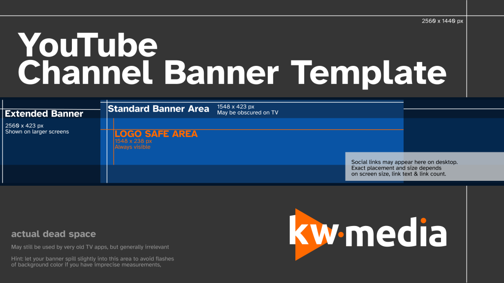
This template helps you create a channel banner in the right dimensions, so that it’ll look good on any device.

Channel banner measurement basics
- The Logo Safe Area (1548x238px) is always visible. If you put a logo or text in general in your banner, keep it inside this area.
- The Standard Banner Area (1548x423px) is shown on most devices. On YouTube-on-TV apps (which includes Chromecasts, AppleTV and game consoles), viewers have to scroll up to see the the part of the banner that’s outside the logo safe area (vertically).
- The Extended Banner (2560x423px) is shown on devices which have large enough screens. This is generally everything except mobile devices. Again, viewers on TVs will have to scroll up to see the full vertical content.
- The area around this is completely dead space. It persists for legacy reasons: Many years ago, TVs used to show much more of the background image. However, due to most people doing banners and not bothering with a full view, even TV users now see a banner. Since YouTube is ignoring this area, you should too – use a simple color as your background for this area.
- It’s generally helpful to have your banner exceed slightly the absolute minimum area. In case YouTube tweaks something in the future, this avoids you having to re-do your banner just for a few pixels. In the template above, the blue area is 450px tall in total, even though you actually just need to care about the inner 423px today.
- The maximum file size you can upload to YouTube as your banner is 6MB.
Advanced Usage Tips
- You can use your banner to inform viewers visiting your channel about current events and schedules. If you upload on Mondays and Fridays, you can say exactly that in your banner.
- Keep the branding in your banner similar to your thumbnails and your profile picture. This doesn’t mean that you have to put your logo in all three, but rather that all elements should look like they belong together somehow.
- Use high-quality materials, if at all possible. Taking a low-quality image and stretching it until it’s banner sized won’t look good.
- Avoid overcrowding your banner and making your banner too “loud”. The banner exists above your channel, underneath it your videos and the subscribe button. You want to make the banner have some attention, but not have it grab all attention. It only needs to fit your branding, it doesn’t need to attract clicks!
- Add a value proposition to your banner. If there’s something which makes your channel unique (like: “vlogs without talking”) which isn’t immediately obvious in your thumbnails, say it in your banner.
Questions or need a banner made for you? You can hire us!
Alternatively, you can also get help from other creators on discord.gg/youtubegaming.
Hello! Great tips and tricks! Di you have any advice for better management of Bandcamp webpage or other social media for creators? Thans, & Cheers! 🖖😈